The return of pastels sees two shades chosen as must-haves for your kit. Writes Ashleigh Sharman.
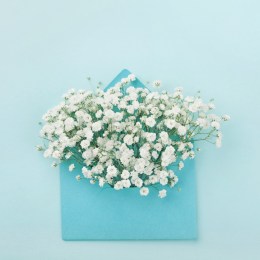
As Pantone’s Colour of the Year 2016 is finally revealed in a combination of soft tones, makeup and nail artists around the country rummage through their kits to locate the prized pastels Rose Quartz (13-1520) and Serenity (15-3919).
And with it comes mindfulness and wellbeing — Pantone suggesting its colours will act as an antidote to modern day stresses, playing on our need for reassurance and security amidst a world where climate change and terrorism threaten our very humanity.
“Joined together Rose Quartz and Serenity demonstrate an inherent balance between a warmer embracing rose tine and the cooler tranquil blue, reflecting connection and wellness as well as a soothing sense of order and peace,” says Leatrice Eiseman Executive Director, Pantone Color Institute.
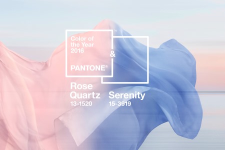 “Rose Quartz is a persuasive yet gentle tone that conveys compassion and a sense of composure. Serenity is weightless and airy, like the expanse of the blue sky above us, bringing feelings of respite and relaxation even in turbulent times. A symbolic colour selection… the pairing of Rose Quartz and Serenity brings calm and relaxation.”
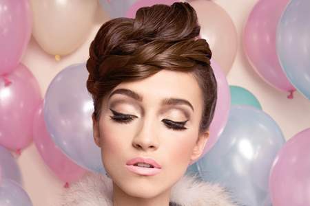
This balance of colour fuses traditional oppositions of warm and cool, feminine and masculine, soft and hard, earth and sky, delivering up a trend that makeup artist Sabrina Melei predicted from the runways of New York Fashion Week.
“Pastels and soft designs were so strong at New York Fashion Week that I’m not surprised at all by Pantone’s announcement,” says Sabrina.
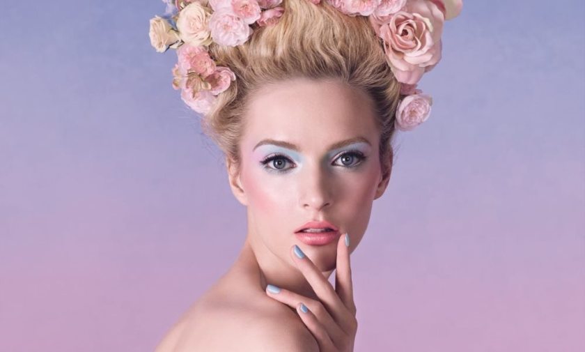
“The two colours, Rose Quartz and Serenity, are easily adaptable for clients and a real pleasure to wear — it’s about finding the right version of the trend for your client’s skin tone and the application most suited to their makeup look.”
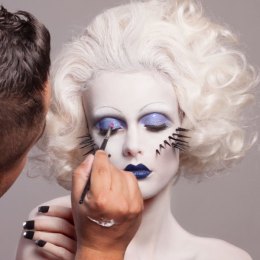
Sabrina suggests that the use of pink blushes, shimmer, and strobing, can easily offset blue nails for clients wishing to easily adopt both colours or for those more adventurous, coloured mascara and eyeliners without the retro flashback teamed with pink lipstick or lipgloss.
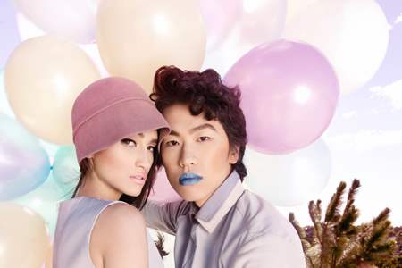
 “Coloured mascaras are back and this is a great way to inject colour around the eye, especially for brown, hazel, and green eyes,” Sabrina explains.
“Blue eyeliner, inside the inner rim of the eyes is a very high fashion look and can be great for clients who are willing to take a risk with their everyday makeup. It’s really not so scary!”
Sabrina however is keen to point out that although Pantone is very clear about its colour predictions, there is room to move with clients who may prefer lilac to shades of blue and rose gold over pinks; adding our summer season, and likely tanned bodies, will adapt well to the pastel tones.
 “There is so much great product out there that, as makeup artists, we have to be sure to choose and suggest what suits the skin tone best — trends are always adaptable.”
“Overall though, I feel these colours suggest softness. Flowing, calming, relaxing, these colours act to slow us down and be a bit more in balance with ourselves.”
And if makeup can potentially deliver us a helping of wellness then it’s probably worth a shot.
Images: Main Image (Dior 2014), Story Images (Sabrina Melei 2014, 2009)